by Donna Kopsick
The use of color is one of our best decorating tools. Color affects our surroundings, creating a particular mood, along with an ability to bring harmony. An emphasis on details, especially architectural, impacts the dimensions of a room.
 Color used in interior design can be pulled from colors in fabrics, art, rugs, and accessories. Inspiration is limitless. Paint chips are helpful in choosing colors for walls and trims. The color wheel is a useful tool to help select color schemes. When studying the color wheel, colors are sectioned off according to:
- Primary — red, yellow, blue
- Secondary — orange, green, violet
- Tertiary — red-orange, yellow-orange, red-violet, blue-violet, blue-green, and yellow-green
Black added to color creates dark tones or shades. White added to color creates tints.
 Light intensity in a room can alter the appearance of color. It is a good idea to test a color choice in a small portion of a room before applying color to a larger section. Observe the effect of different times of the day on the sample color, to see how light affects the look. Light-colored walls expand a room’s dimensions. Dark colors give a large room warmth and enclosure.
A knowledge of the characteristics of the color helps in color selection.
- Red — a sense of taste and smell are heightened; stimulates heart rate, respiration and blood pressure; use in small amounts, such as in accessories, fabrics and upholstery, if a red wall would be too stimulating; good choice in kitchens, dining rooms; often seen in restaurants
 Yellow — cheerful, uplifting, welcoming, energizing; feels expansive; good choice in kitchens, dining rooms, bathrooms and entryways
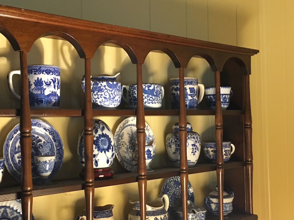
- Blue — calming, relaxing, restful; decreases heart rate, respiration and blood pressure; deep blue to light blue can be used in any room from traditional to contemporary in style; light shades of blue are often seen in hospitals
- Orange — stimulates appetite; warm energy; milder values, such as terra cotta, salmon, peach, coral, and shrimp are less jarring to the eyes; good choice for living rooms, dining rooms, and kitchens; also often used in restaurants
- Green — relaxing, restful, comforting; good for any room
- Violet-purple — dark values are rich, sophisticated, creative; lighter values are restful
- Neutrals — white, tan, creams and taupes, beiges, gray, brown, and black; balance a room, and heighten deeper colors in room; restful; give depth and weight; unify; reflect nature’s earth tones and light; expand space; often found in a home’s architectural details such as stone fireplaces, wood furniture, pottery, sisal rugs, baskets, and fabrics; black is a good accent color in small amounts; white trim throughout a home creates unity from room to room; often used in contemporary settings, such as art galleries and museums
