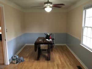
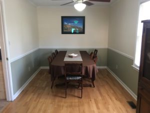
So this is my dining room:

A little dated, right? The white border is not to my taste, and the pink wallpaper above the chair rail is pure ’80s. Well, the time has come to change that. So how do I go about that project?
- Pick a new paint color. If you don’t have an artist’s flair and love dabbling with shades, I recommend going with a palette that appeals to you.
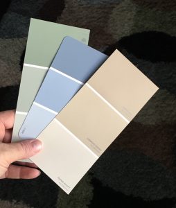
 Paint displays at the store will have idea pamphlets that give you a bunch of tints that coordinate well. You can browse for the one you like best, then keep that for times when you need to choose a color. Whatever is on the palette will work, so it’s a safe choice. I have used an even more limited palette in our house — being more neutral than colorful myself. Do what works for you.
I went with the medium green below the chair rail and the lightest tan above it. - Prepare your wall. Take off all the outlet covers and curtain rods, and take down anything hanging on the walls. Spackle where needed to cover nail holes or gouges. If you use painter’s tape, line your edges now to get ready for a clean line when you paint. Set out your drop clothes, if those are needed.
 Gather your materials. If you refresh your paint regularly, you probably already have brushes, pans/liners, paint keys, and such in storage. If so, you’ll just need to buy the paint. If not, have a good, angled trim brush, a roller with a cover, a roller tray, a cup for trim paint, and a wet rag available, along with your paint.
If you’re new to this, you can watch a few how-to videos online or ask a friend for tips.- Paint the wall. Use your angled brush to outline the edges of the section you are painting. You only need about the width of the brush on the edge, since the roller will cover the rest. Paint around the outlets or any small interruptions in the wall also. Then you roll. Start at one point and continue on around the room until everything is evenly covered.
- Put on a second coat or touch-up. Once the paint is completely dry, check your coverage. Sometimes you need to repeat the previous step entirely for a second coat. Sometimes you just need a chip brush to blend in a few spots. Either way, make sure you lightly blend the second coat so you don’t have paint ridges on the wall.
- Put the room back together. Once the paint is complete and dry, you can put all the outlet covers back on and replace the furniture.

It can be done. You can do it too. And when you have done it, enjoy your brand-new look!


 Color used in interior design can be pulled from colors in fabrics, art, rugs, and accessories. Inspiration is limitless. Paint chips are helpful in choosing colors for walls and trims. The
  Light intensity in a room can alter the appearance of color. It is a good idea to test a color choice in a small portion of a room before applying color to a larger section. Observe the effect of different times of the day on the sample color, to see how light affects the look. Light-colored walls expand a room’s dimensions. Dark colors give a large room warmth and enclosure.
 Yellow — cheerful, uplifting, welcoming, energizing; feels expansive; good choice in kitchens, dining rooms, bathrooms and entryways